Want to learn advanced compositing from a professional creative director? Join us as Dave Pasciuto walks us through his process for creating an amazing Cyber City set in the year 2157, showcasing his vast skill set using Photoshop and other tools to make some sci-fi magic happen.
![]()
This image was created specifically for Adobe MAX 2020 using the innovative PixelSquid plugin for Photoshop.
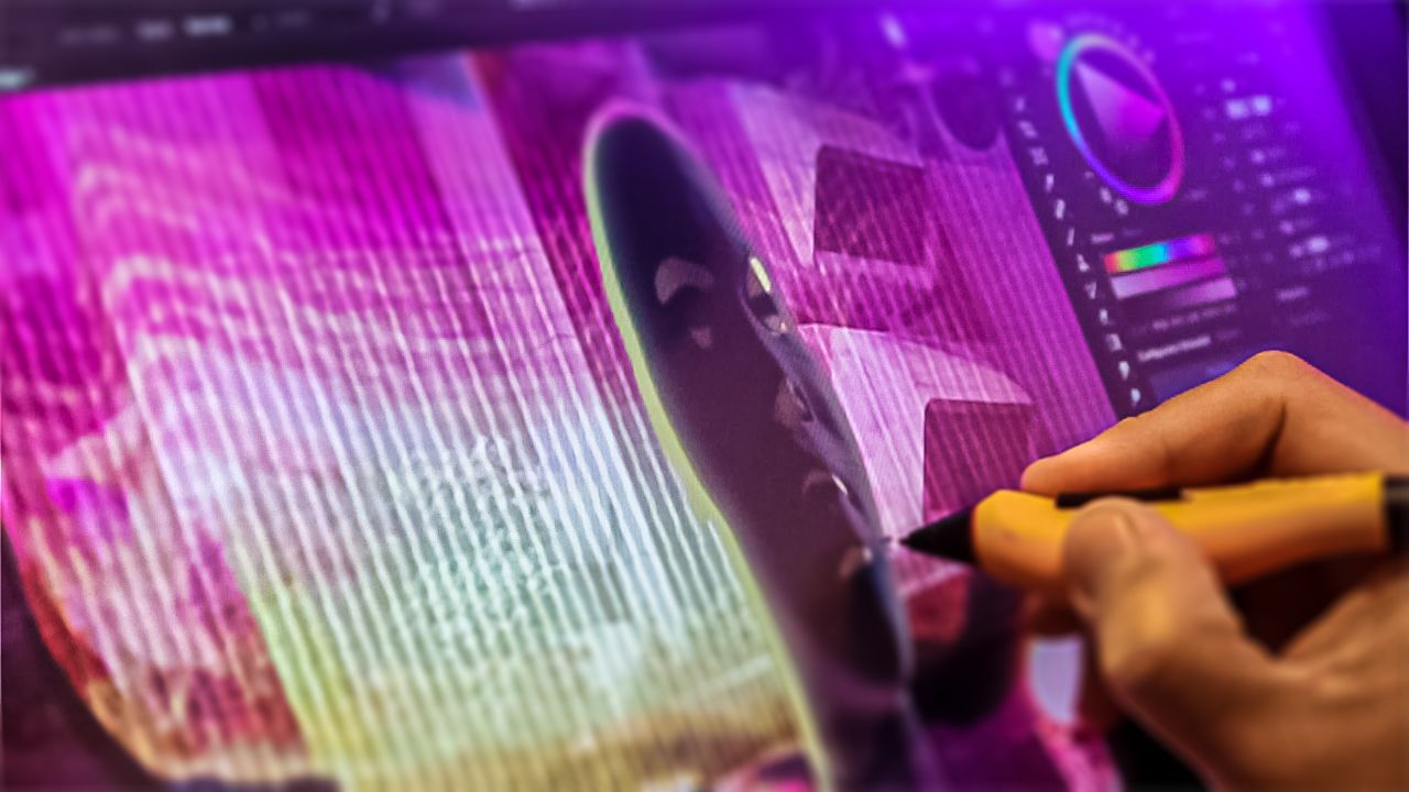
PixelSquid is great because it is not overly technical. With an imagination and a creative approach, you can use the objects to create new objects without actual 3D. While I love 3D as well, this is much faster for most concepts, as I can get any object in 3 clicks, find the perfect angle I am looking for, and save a ton of time by NOT masking anything and focus on compositing the image.
The year “2157” is a time I used to think of the future when I was younger. I would draw comic books set in that year, imagining what it would be like, and if I would live to see it. Hah! Working on this image was nostalgic—yet fun, intense, challenging, and very humbling. I hope I did my heroes justice. Enjoy.
–Dave Pasciuto
Techniques Used
- Sketching via Procreate
- Photography & Photo-Stitching
- PixelSquid Lightbox & Objects
- Digital Paint & Advanced Compositing
- Lighting & Shadow Layers
- Layer Styles, Post Effects, & Finishing
PixelSquid Objects Used
This image took 22 objects plus a variety of other photos that I took from when I actually attended the Adobe MAX Conference in 2016 in San Diego. Each of these objects was used verbatim or by kit-bashing different objects and components to create new objects.
Additional Plug-ins Used
- PixelSquid – Design-ready 3D objects with perfect transparency for Photoshop.
- Coolorus – Color Panel
- Brush Box – A better brush manager for Photoshop.
- Configurator Reloaded – Speed up your custom workflow in Photoshop.
- Filter Forge – High-end software for photo effects, texture generation, and render maps.
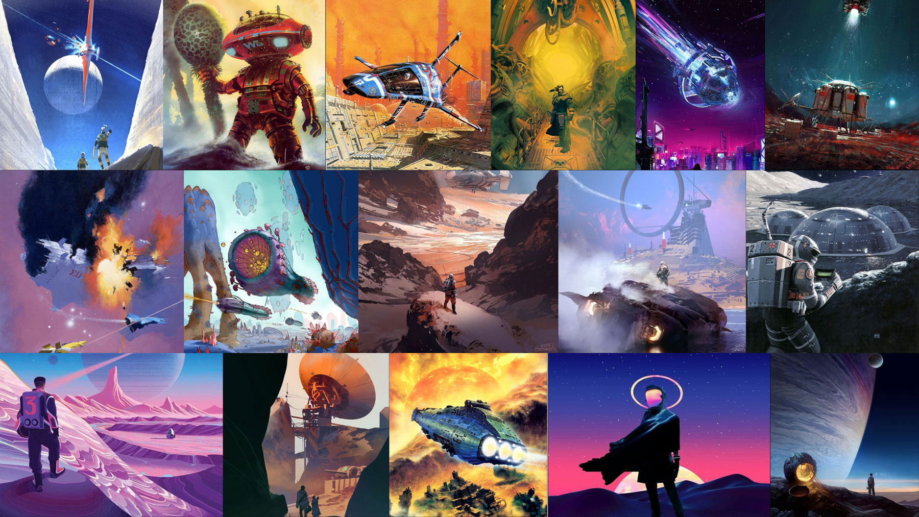
Inspiration & Mood Board
I am a huge fan of science fiction, and have been ever since I was a kid. With this image, I wanted to create something epic and I also wanted to pay homage to my favorite artists like Chris Foss, David René Christensen, Matthew Borrett, John Harris, Peter Elson, and newer talents like Pascal Blanché, Sparth and more—all incredible artists and imagery.
While looking for inspirational images I was reminiscing about one Christmas long ago when I got an art book of spaceships by Chris Foss. I was so blown away because I’d never seen anything like it. The art was way ahead of its time and still refreshing to this day.
Also, having some cool music to work to is also important to put yourself into the vibe of it all. So a very special shout-out goes to Brian Hazard of Color Theory for the usage of his synthwave music! Thank you!
I wanted to tell a story about attending the Adobe MAX conference in the future, perhaps even off-world. Many photos from the actual event I attended back in 2016 are used in the creation of this image. So meta!
-
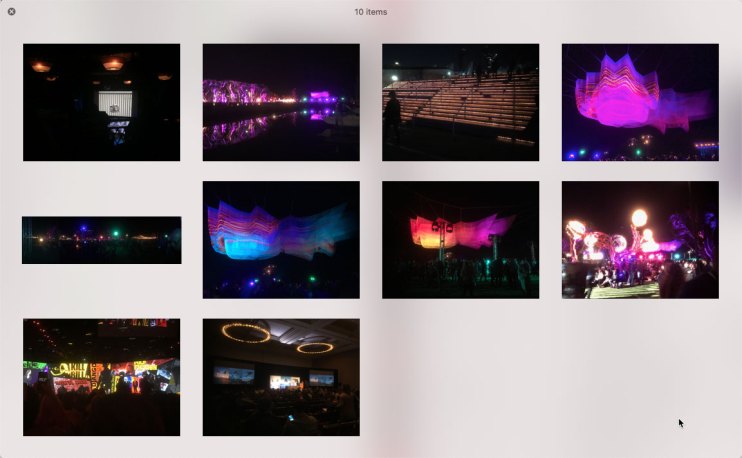
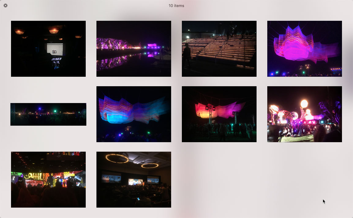
- Here are the images I used from Adobe MAX 2016. They were from the event itself and the after-party in San Diego. Also when the Chicago Cubs won the World Series!
-

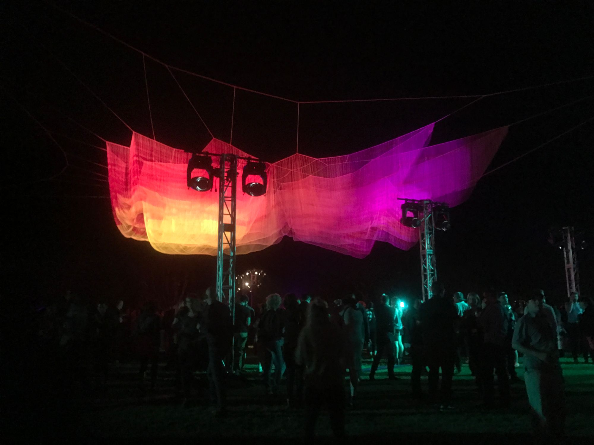
- Sculptor Janet Echelman, is known for her larger than life living, breathing netting sculptures installed in civic areas across the globe, explained how a lost shipment of paint in 1997 forced her to find new creative avenues.
Finding great inspirational images is never the hard part. It comes down to curating design, color, composition, and elements that depict the feeling that I’m looking for. I also love synthesizers and Synthwave music, so I wanted to tie in some of that retro feel as well, hence the magenta, purples, and vibrance.
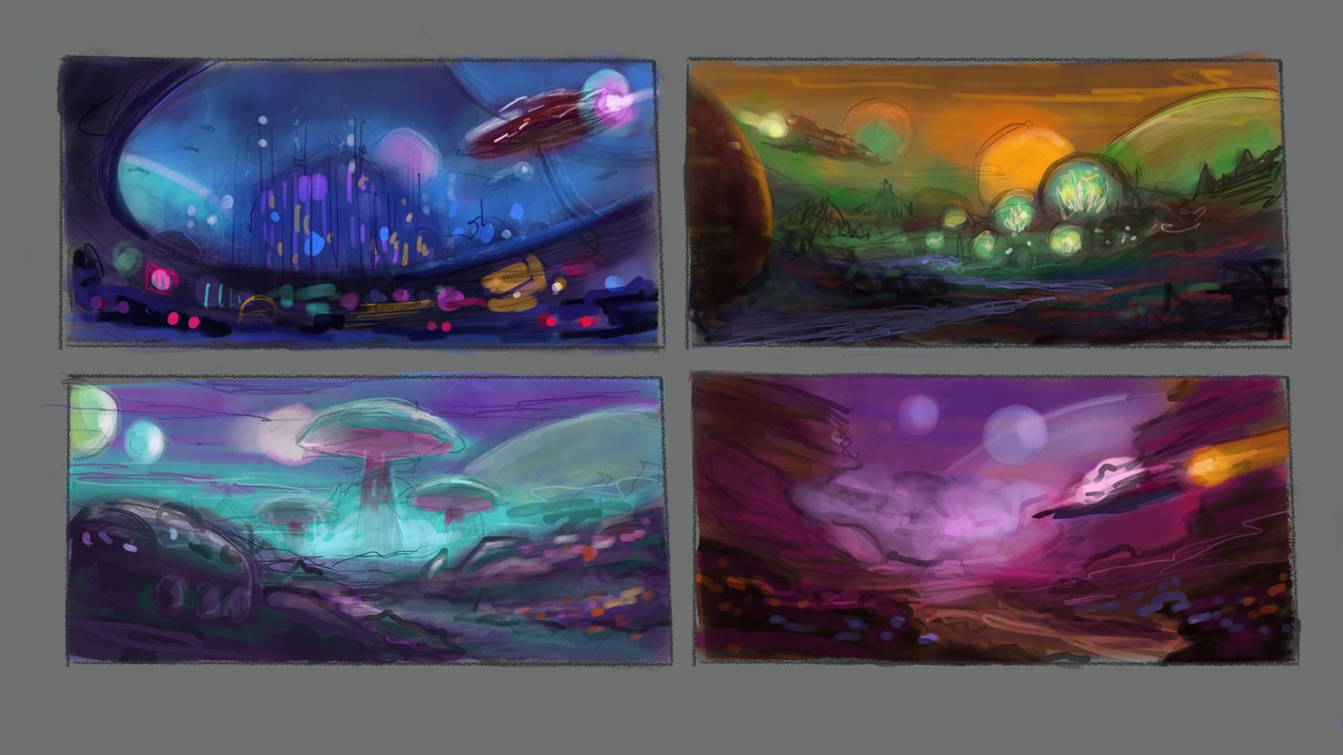
Concept Sketching & Thumbnail Process
Now that I have the inspiration and I have my mood board, it is time to start the visual development process and sketch out some thumbnails. I use Procreate on my iPad to sketch out some ideas. While I prefer using my Wacom Cintiq and Photoshop, there is something to be said for lounging on the couch and sketching while binging on your favorite Netflix show.
The goal of this exercise is to generate multiple ideas very quickly. While some thumbnails can look very finished, mine are very loose. So very quickly, I created four thumbnails with four different interpretations of the same idea, without investing a lot of time.
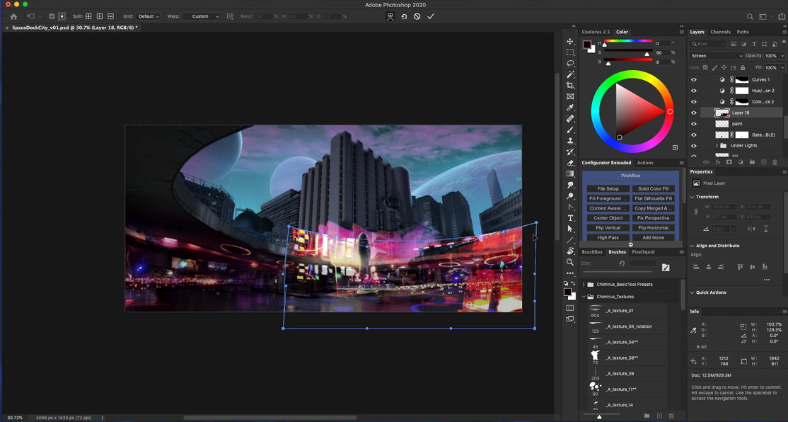
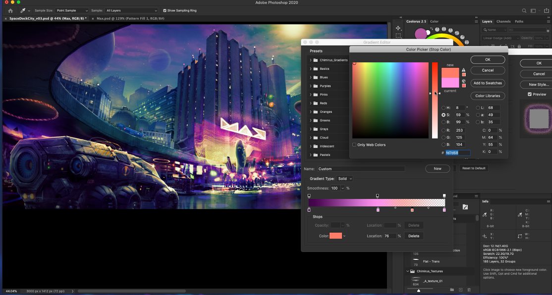
Photoshop Setup & Compositing
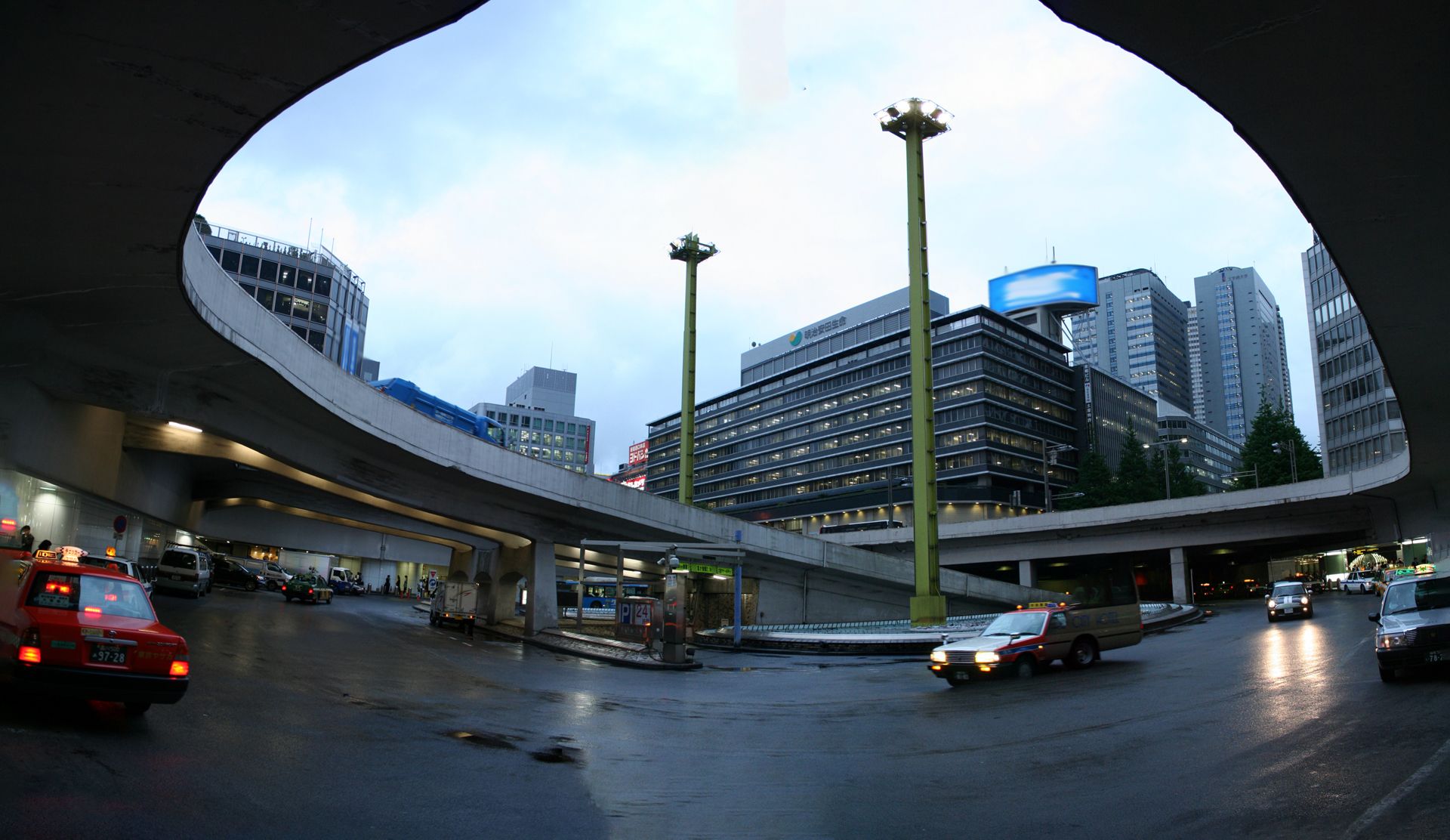
It is usually efficient to start your image off with a base, or a “plate.” This is an image that contains a chunk of the elements that your image needs. For this image, I used a panorama of the Shinjuku train station while on a vacation to Tokyo. The image was right when I walked outside and saw this huge curved bridge, and I instantly knew I wanted to use it into some piece of art.
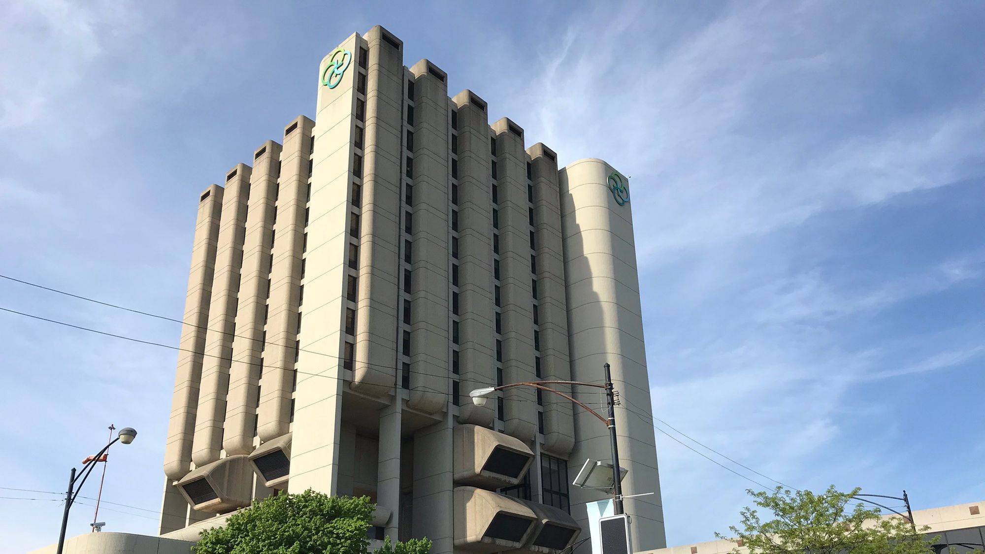
Also living in Chicago, I am by a hospital where the building design looked like it could be from a spaceship or the future. Again, I wanted to incorporate this into some of my art too. This was the perfect opportunity.
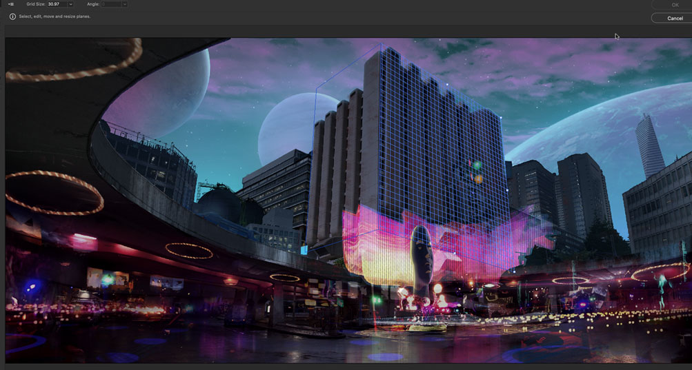
In Photoshop, I had to stitch together the photos using Photomerge. Then I had to do some masking to quickly composite the two together, fix the perspective, and then create my perspective guides for the main back plate.
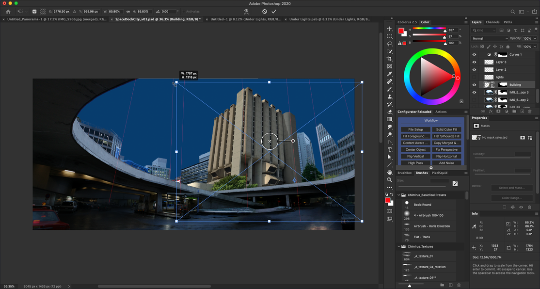
Advanced Compositing
Using Adobe Photoshop and my image and tool resources, this is where the magic begins to happen. Importing, masking, and dialing in each individual element so it “fits” into the image seamlessly are the goals. This part of the process was fun but also due to the number of items and detail, it got tedious for sure.
The important part to remember is to work from back to front and build up your image. Just like in real life, the sky is “behind” everything, and everything from the horizon to you is stacked on top of each other in visual priority. You want to mimic this in the Layers Panel.
I try to baseline every element that I bring in and tweak the value and color while taking time to review the composition in black & white for contrast and depth. You can’t have great color without great value. Your image focus needs to “read” properly by consciously designing a composition that supports that focus and the lighting.
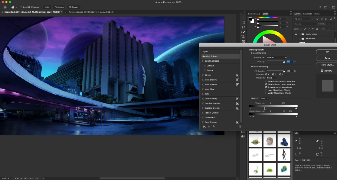
Effects, Color Grading, and Finishing
Once you have your composition and elements put together and you feel like you are done, you are not. This is where you bring that extra 10% of polish by using color grading, sharpening, and filter effects to really make your image pop.
Using additional plug-ins like Filter Forge with Smart Objects is a great way to take your imagery beyond Photoshop can do, and into another world!
Dave is an award-winning creative director who has worked across multiple industries—focusing on high-visibility projects for film, animation, video games, and advertising campaigns that span every market.
He has worn many hats through his journey, working as a creative/art director, vfx artist, concept artist, illustrator, compositor, and animator in feature film, broadcast, advertising, and video game industry. His diverse client list includes Disney, Nickelodeon, Sony, Activision, and Electronic Arts on licenses like Star Wars, Marvel, TMNT, and many more.
Dave is also deeply involved with personal coaching, teaching courses, designing tutorials, and presenting workshops between Los Angeles and Chicago for world-class schools like Gnomon School of Visual Effects, Columbia College Chicago, and Chimirus.
Chimirus specializes in world-class creative coaching and training. During the week of Adobe Max, Chimirus is offering 30% off all online courses! Please use ‘MAXPIXELSQUID30’ at checkout!
https://bit.ly/chimiruscourses
If you’re interested in being featured in our artist tutorials and spotlights, you can email our content team at marketing@pixelsquid.com.