
We’re very excited to present this in-depth tutorial exploring themes of fantasy and light vs. dark by surrealist artist, Aron! Below, you can see the staggering difference between the before and after image and even watch a quick layer-by-layer video to see the work in motion. Read on to learn more about Aron’s workflow and signature style in his colorful tutorial that utilizes some great PixelSquid objects.
-
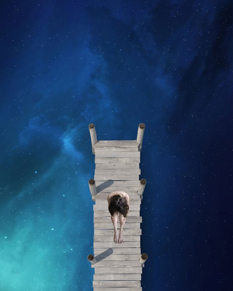
- Before

-
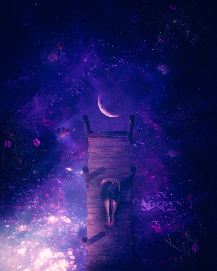
- After
Created using Photoshop on the Huion Tablet.
Stock from Envato Elements and PixelSquid.
Hi there! My name is Aron, and I’m a surrealist Digital Artist from North Macedonia. I’m known as @aronvisuals on Instagram, where my artwork shows off the beauty of the universe. I aim to convey that not everything is as dark as it seems to be sometimes, but that everything magical brings hope. I love to create mostly night scenes with stories from my mind and my dreams.
In this tutorial, I’ll demonstrate how to recreate my ”River Of Dreams” artwork. The idea for this came to my mind a long time ago; I’ve always wanted to create something from an overhead angle, and this was the right time since I managed to collect the stock images. This piece came alive because of PixelSquid and I’m so proud of it. So let’s start!
1. The first thing that I do is create the canvas, which is 4000×5000 and 300 dpi.
2. I am using the stock photo of the universe from Envato Elements as the base for water and the universe together. In the following photos, you’ll see how this becomes a dreamy river.
3. Next, I’ll add a PNG file for more stars. Have you seen Aron’s artwork without so many stars? Nope. Why? Because it’s way more magical like this.

4. I add a water stock photo from an overhead angle to help blend the universe so it will look more like water.
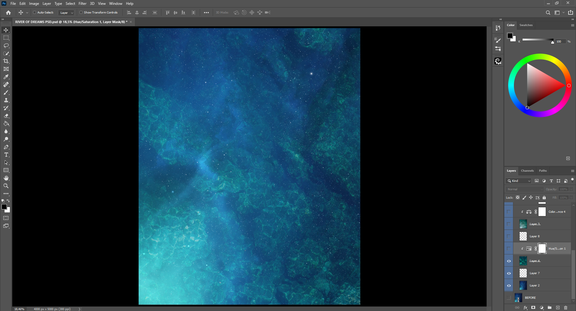
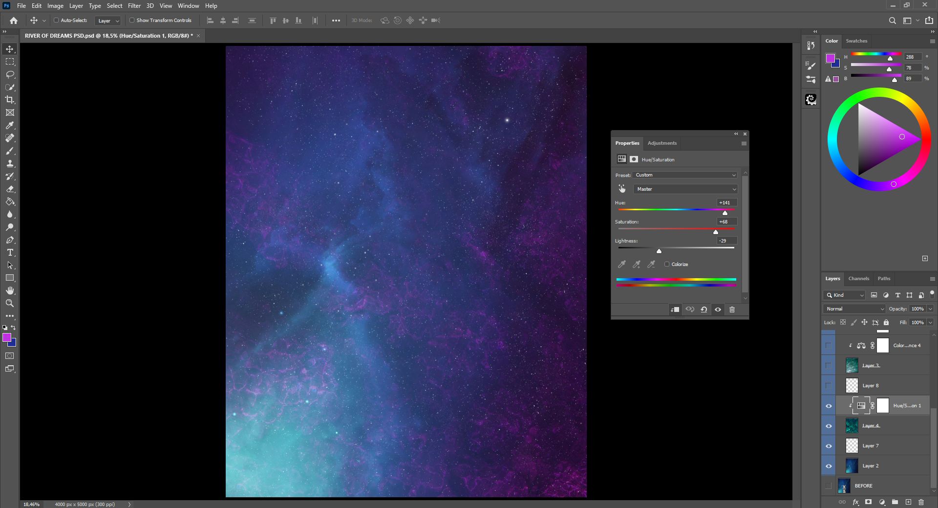
5. I’ll play with the Hue/Saturation on the water stock layer until I get the colors I want. I changed the Hue to +141, Saturation to +68 and Lightness – 29, which caused more of the darker areas to disappear and created the colors that I was aiming for. Remember to press the button to create a Clipping Mask for the layer underneath. Without it, it will affect every layer and not just the one you want to change.
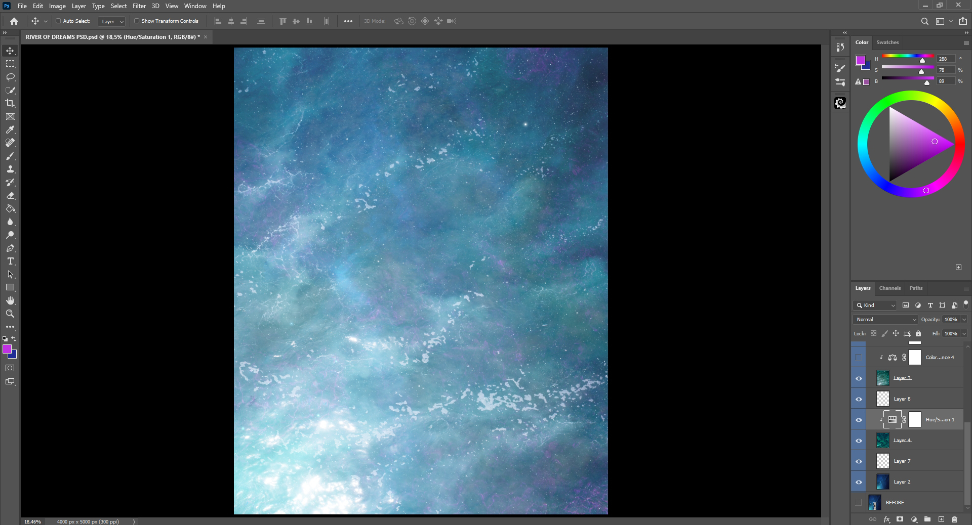
6. Here I add another perfect stock image of water with reflection details from an overhead angle, but now we need to make it darker.
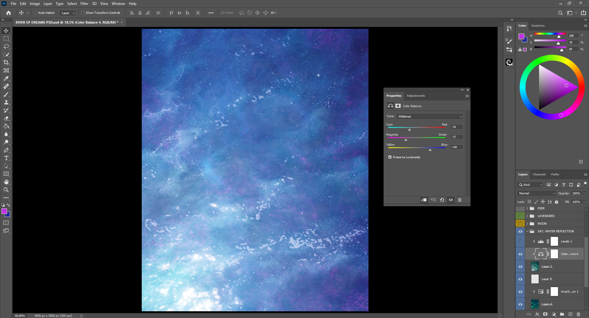
7. First, I want to get more blue tones with Color Balance — Cyan -24, Magenta -37 and Blue +48.
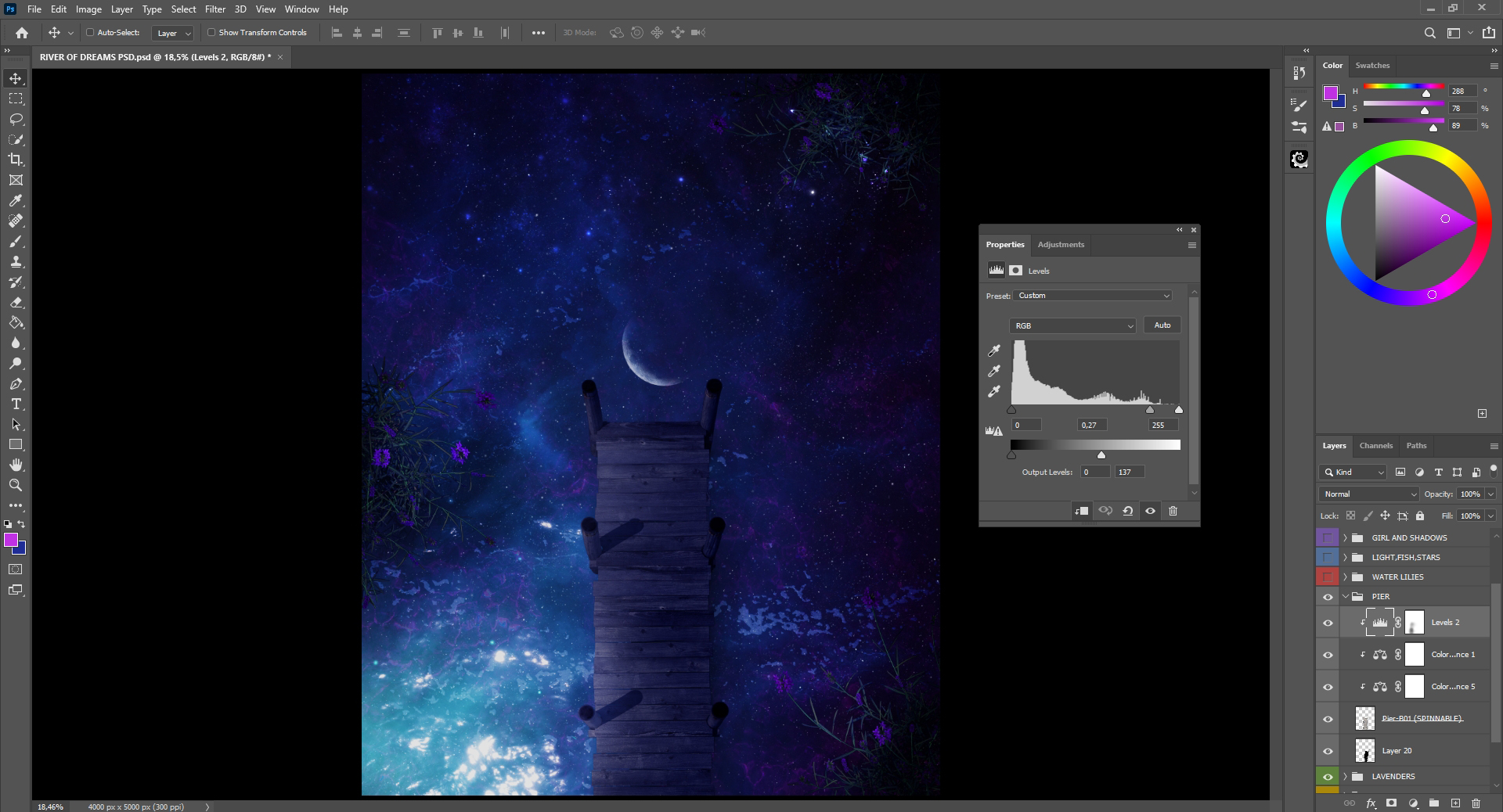
8. Then I use Levels to darken it so that all of my details are more visible.
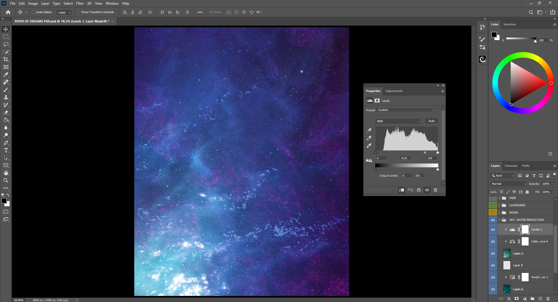
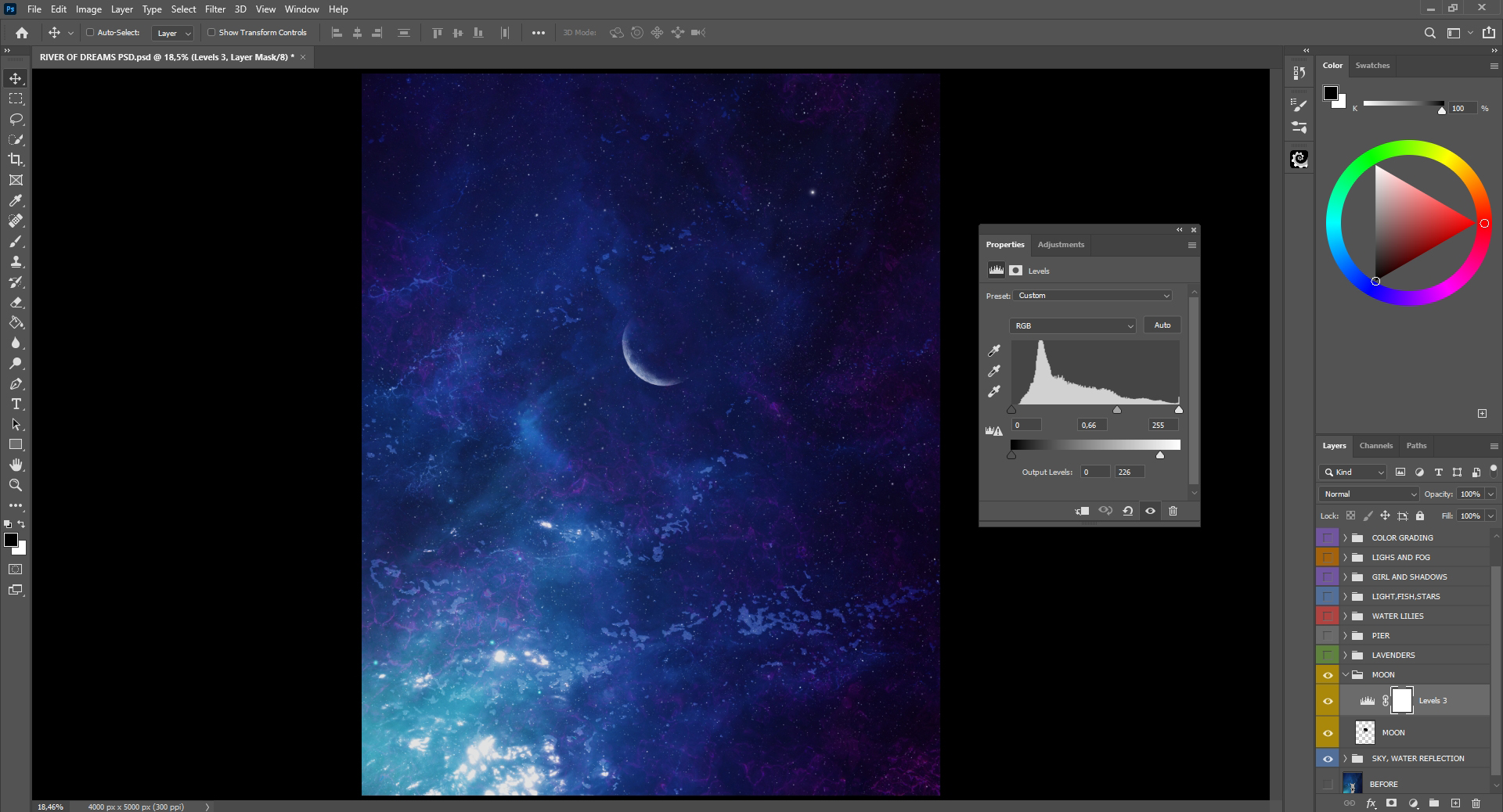
9. It’s time to add the moon, yay! I place a PNG file of the moon and used Levels Adjustment without clipping it to the moon because I still want to make everything darker.
10. Now, it’s time for the lavender object from PixelSquid! I rotate the same lavender object into three different overhead positions since the scene is set up to appear from above. I set them so that they are placed along the edges of the composition. I have a plan for what will be in the center. Wait and you will see!
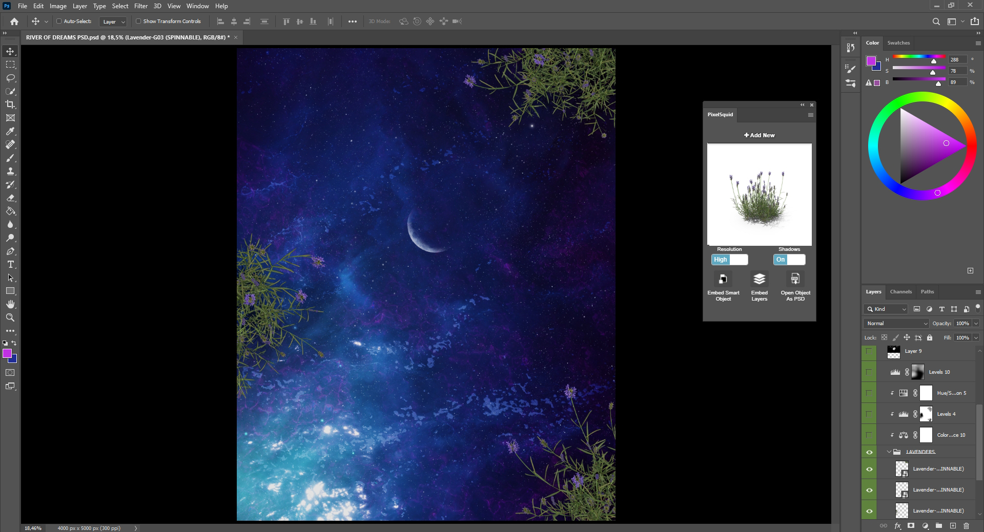
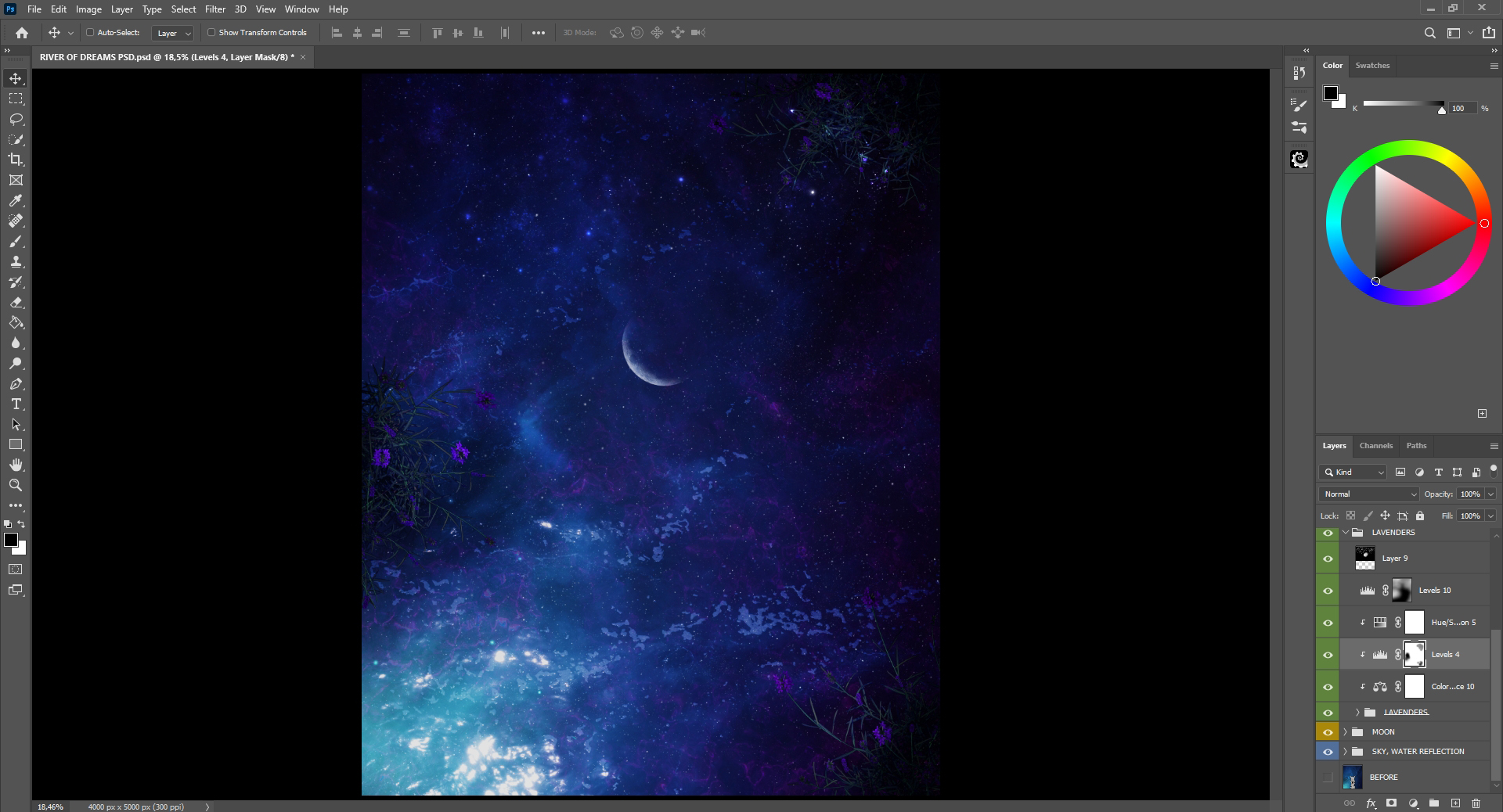
11. Here, I apply Color Balance to the lavender objects, followed by a Levels Adjustment to lighten them, and then start painting on a mask to bring back the original lights from the stock images. Of course, I paint only certain parts by determining where my source of light is coming from. In this case, it’s coming from the lower left corner. After that, I add more stars and use the Levels Adjustment without a clipping mask to make it a little bit darker.
12. Now, it’s time to add the pier object from PixelSquid. Using the PixelSquid plugin, I rotate and select the pier position at an overhead angle and centered it in my composition. The pier includes shadows but my light source is coming from left, so the shadows should go more on the right side. So, I add a new layer under the pier, painted a shadow for the dock, and used Gaussian Blur to blur it a bit with Opacity at 21% to make it look more realistic.
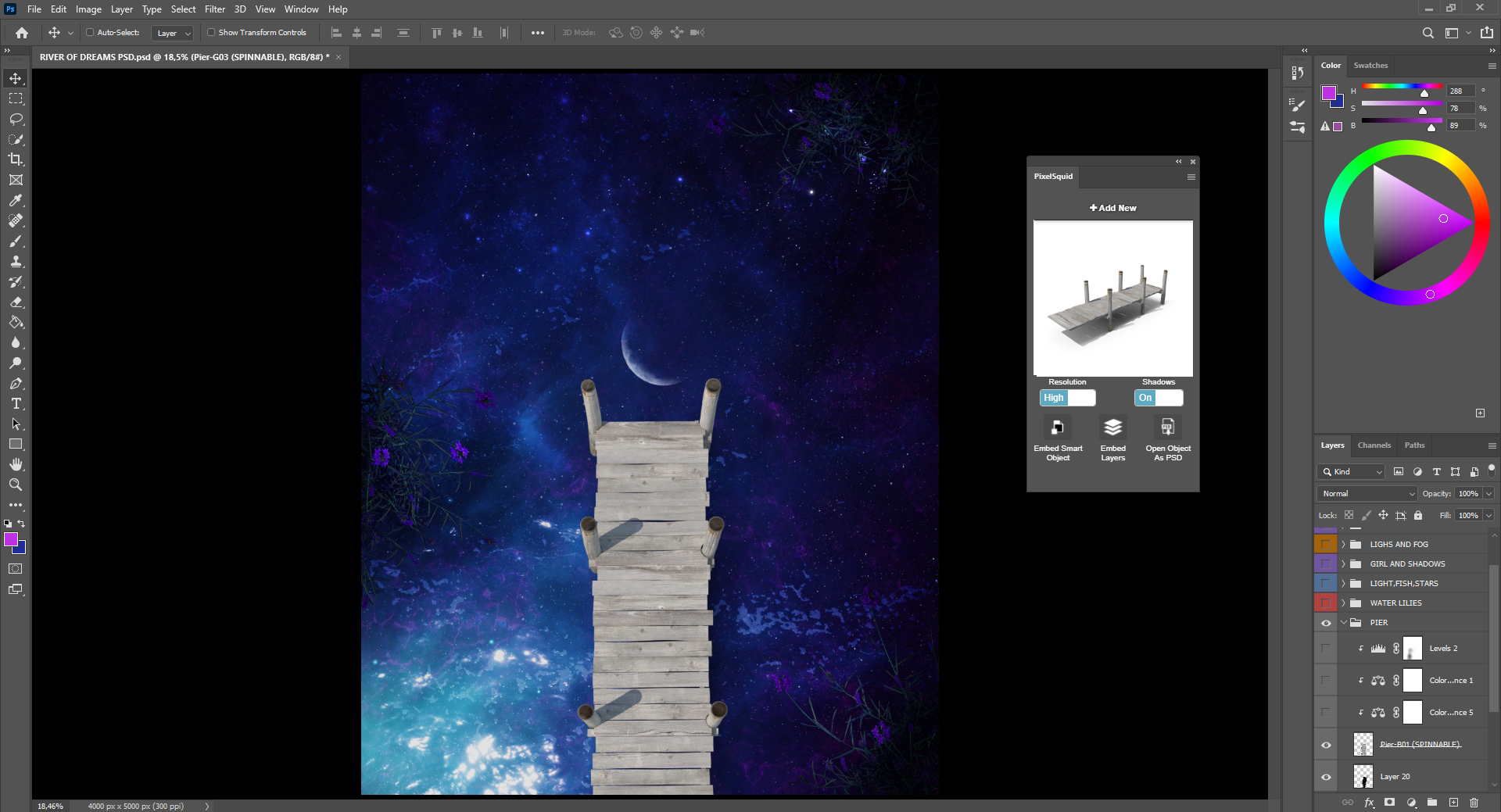
13. I apply the Color Balance twice to get similar blue and purple tones on everything. Then I use Levels again to set the darkness exactly how I want it, and then bring back the original lights. Since my source of light is on the left side, I paint it on the left. Everything is on a clipping mask for the dock layer.
14. It’s time to add some lily objects from PixelSquid. I use 4 different ones from an overhead position.
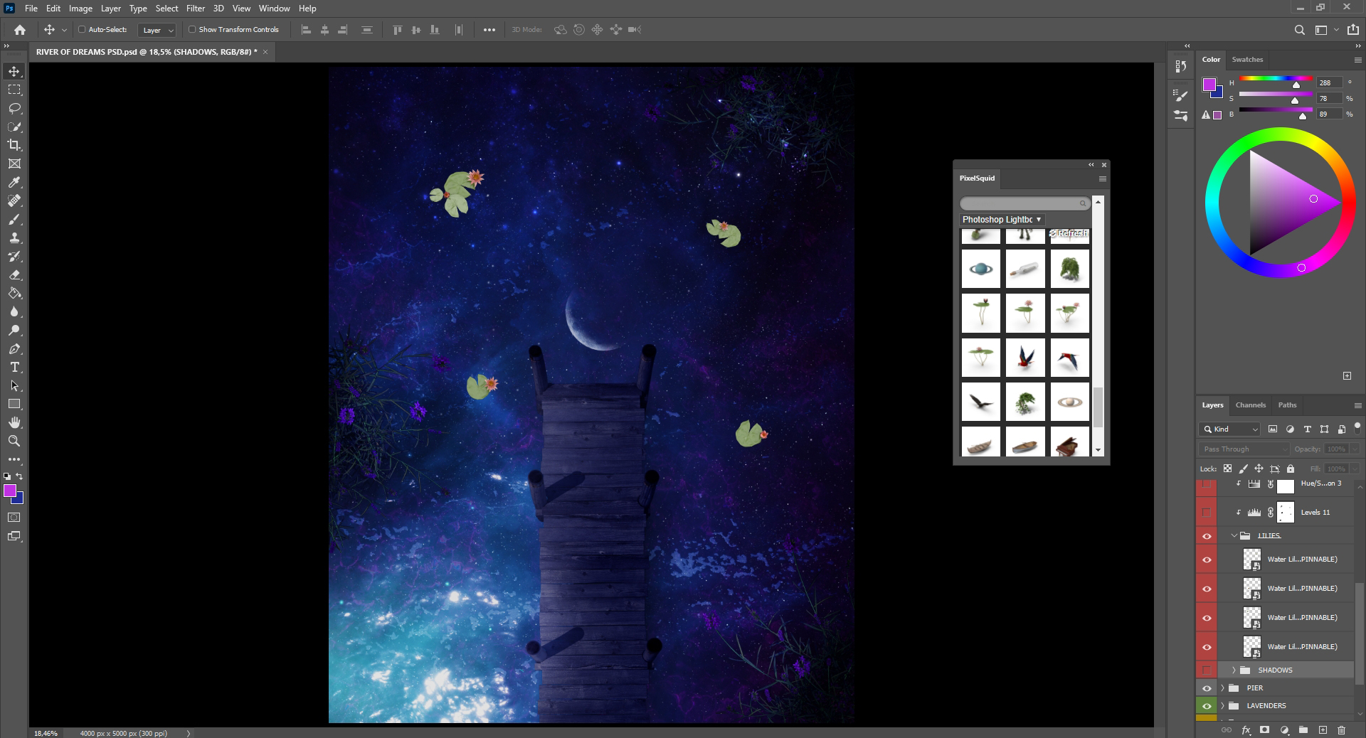
15. Then, on the layer under the lilies, I paint their shadows and lower the opacity to not be so visible. I apply Color Balance and Hue/Saturation Adjustment on the lilies many times to get the colors as I want. And, like before, I apply Levels to darken areas, and then bring back the lights, still paying attention to where my main light source is coming.
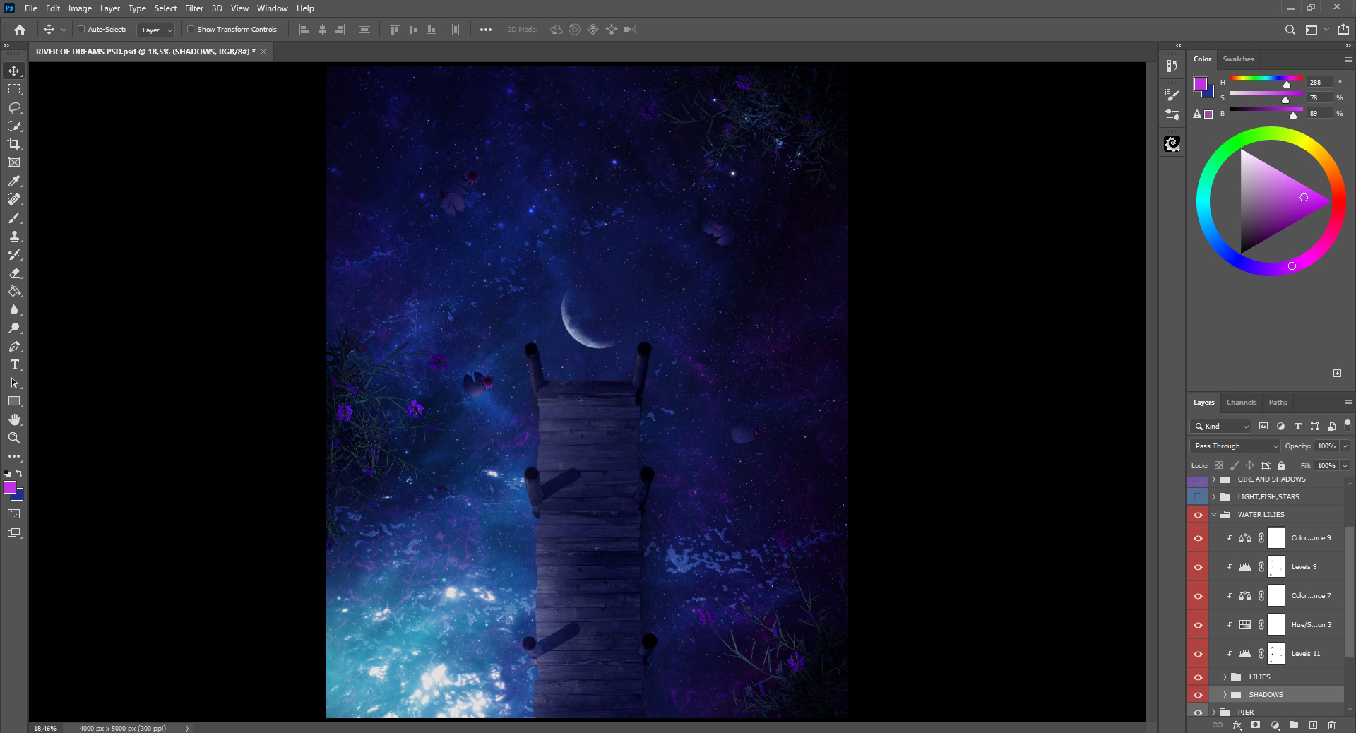
16. I add a fish from PixelSquid and place it- again from the overhead position- to fit the rest of the scene.
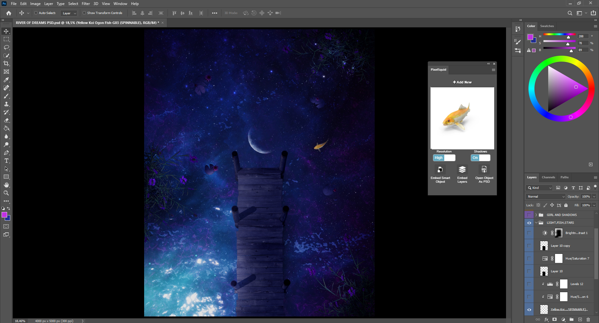
17. I blend the fish in the same way by using Color Balance, Levels, and a lower Opacity. Next, I add a PNG stock of magical stars using Color Dodge Mode at the pier. The plan is to use Brightness/Contrast to darken the area around the full artwork more, invert it (CTRL+I), and then paint there.

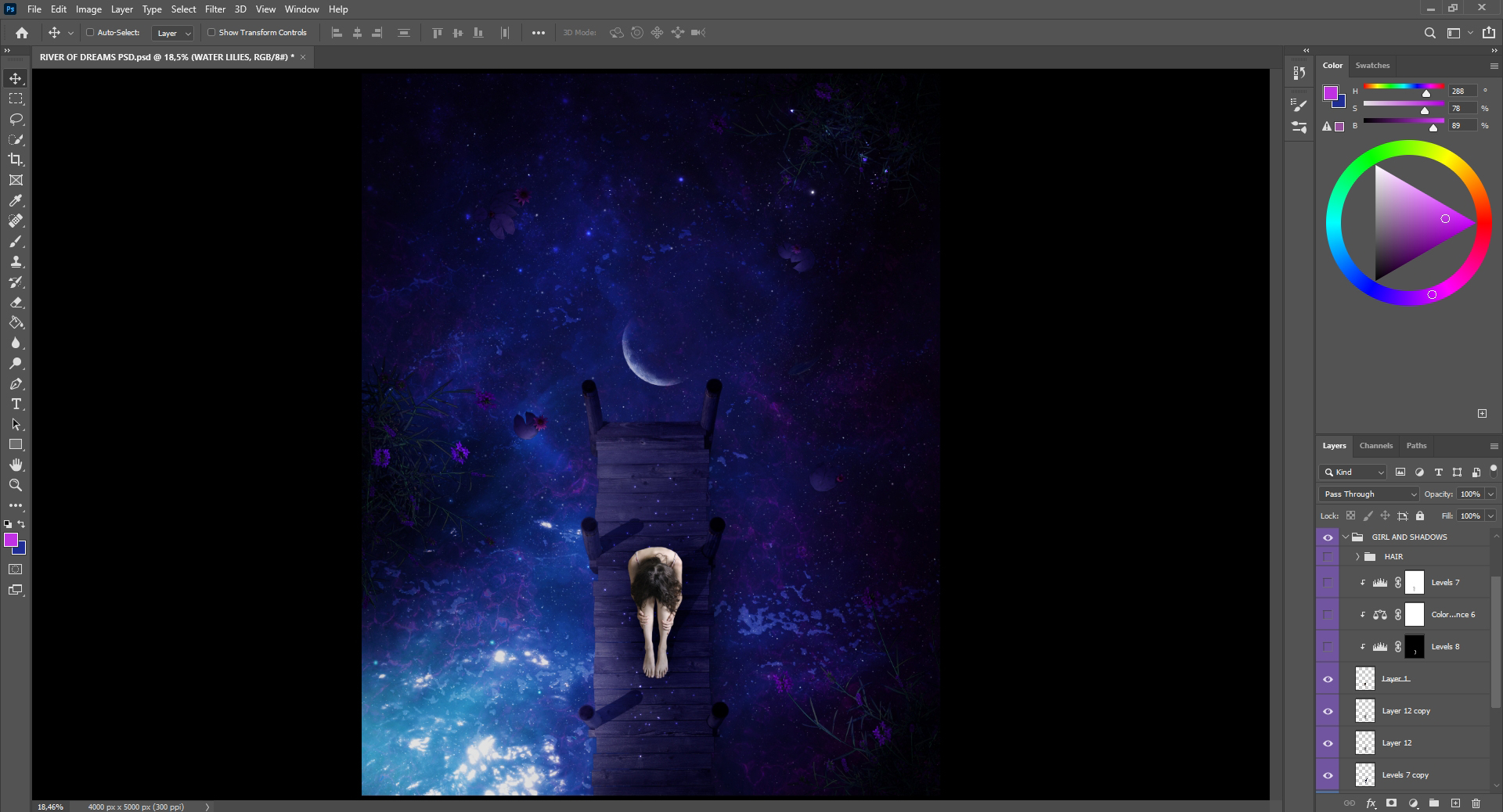
18. And now it’s time to add the most important part of the artwork – the girl on the pier. To remove backgrounds, I always use the Eraser tool, even if I know that it can be done faster with the Quick Selection tool or the Pen tool. I prefer to see the details and do it on my own, which I’ve always done since I started using Photoshop.
After I place her on the pier on the layer underneath, I paint her shadows, again remembering to check my source light from the left side so that shadows are on the right along with the other objects in the scene. I then blur it a little bit, as I did with the other shadows, and lower the Opacity on Soft Light Mode.
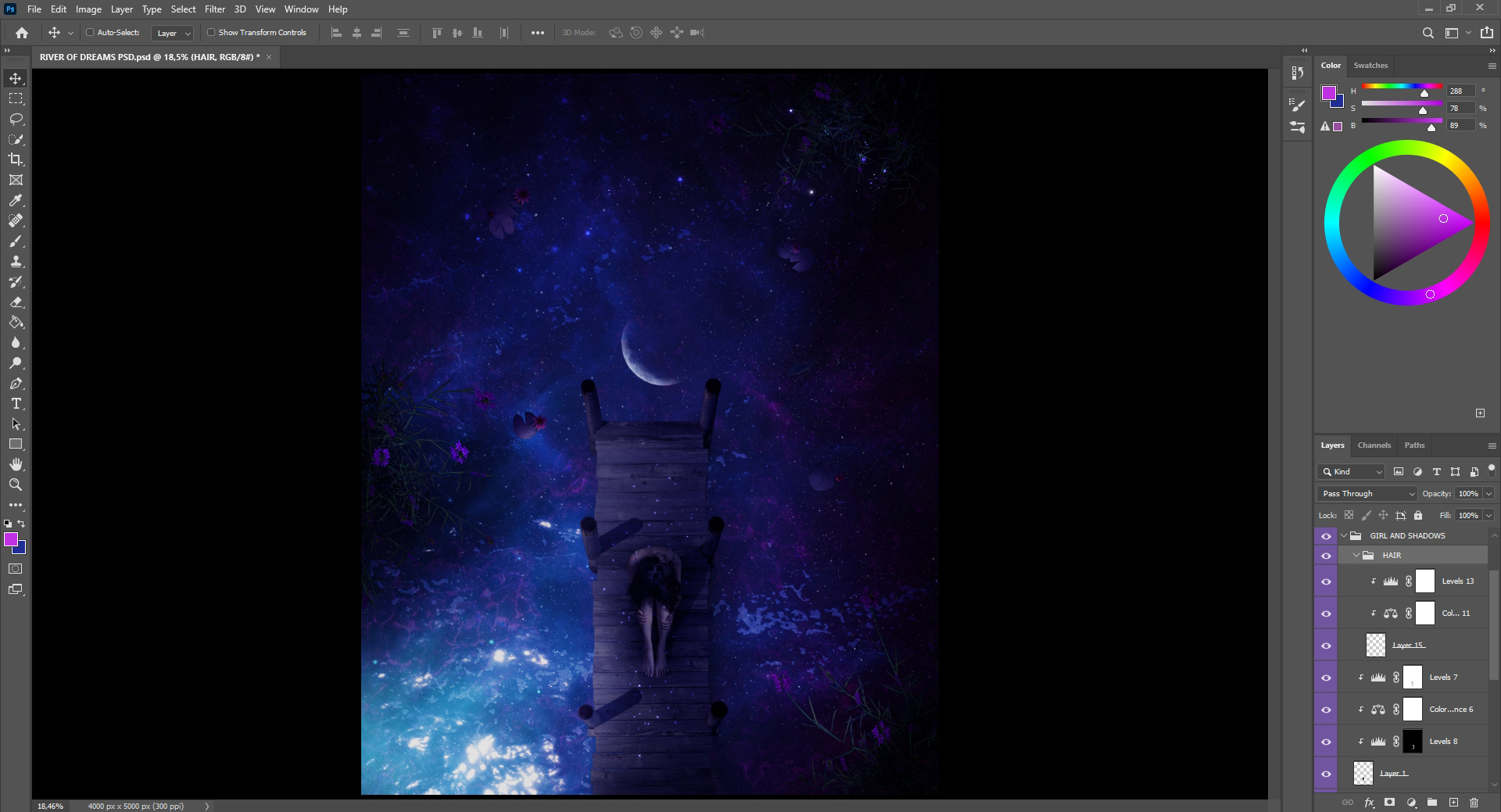
19. Next, I use Color Balance to match the colors and then Levels Adjustment again to darken the girl as well as bring the highlights back on her left side where the light is hitting. On the next layer, I paint some hair on the left and right side of her head to add more details. I used the Huion Kamvas 22 tablet, in case you’re wondering, and believe me– it’s so much faster and better to paint and draw things with a tablet.
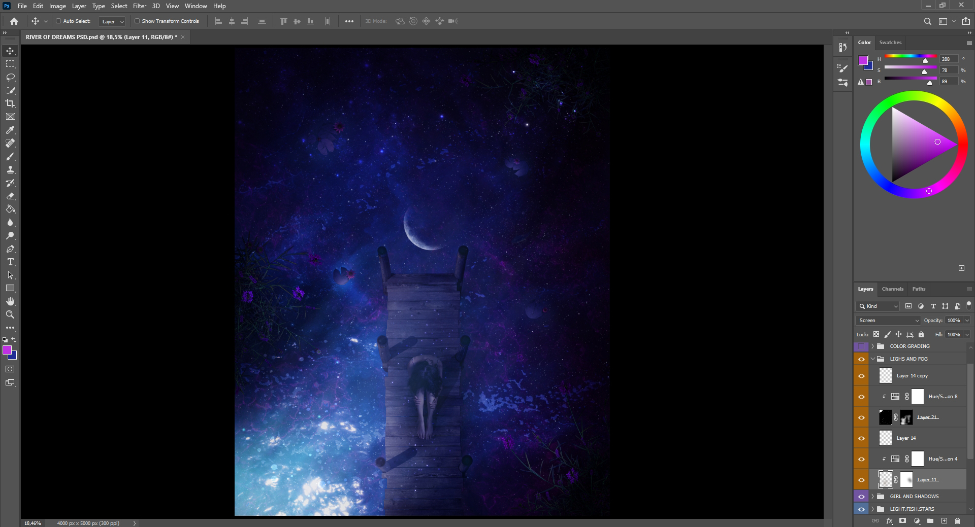
20. In the next step, I add a fog overlay on Screen Blending Mode above all the layers and then use Hue/Saturation shift to the blue tones. I also move the lightness on the left to blend more and use the Clone Stamp to move the fog on the lilies as well. Then, I add a lot of lights on the layer above everything.
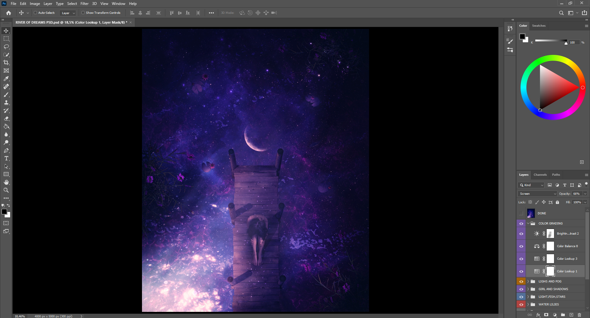
21. When everything is placed well, it’s time to get the final color grading. I’m always using built-in default Photoshop Color Lookups (LUTs). By playing with the blend modes, you can see which one fits the best… in this case, it was on Screen Mode with the Opacity at 66%.
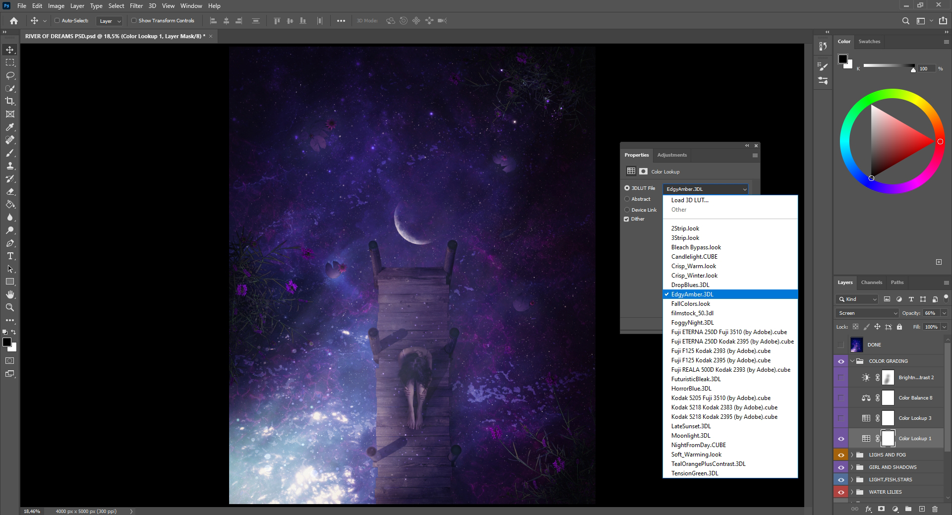
22. I add another Color Lookup, one that fades everything by lifting the blacks.
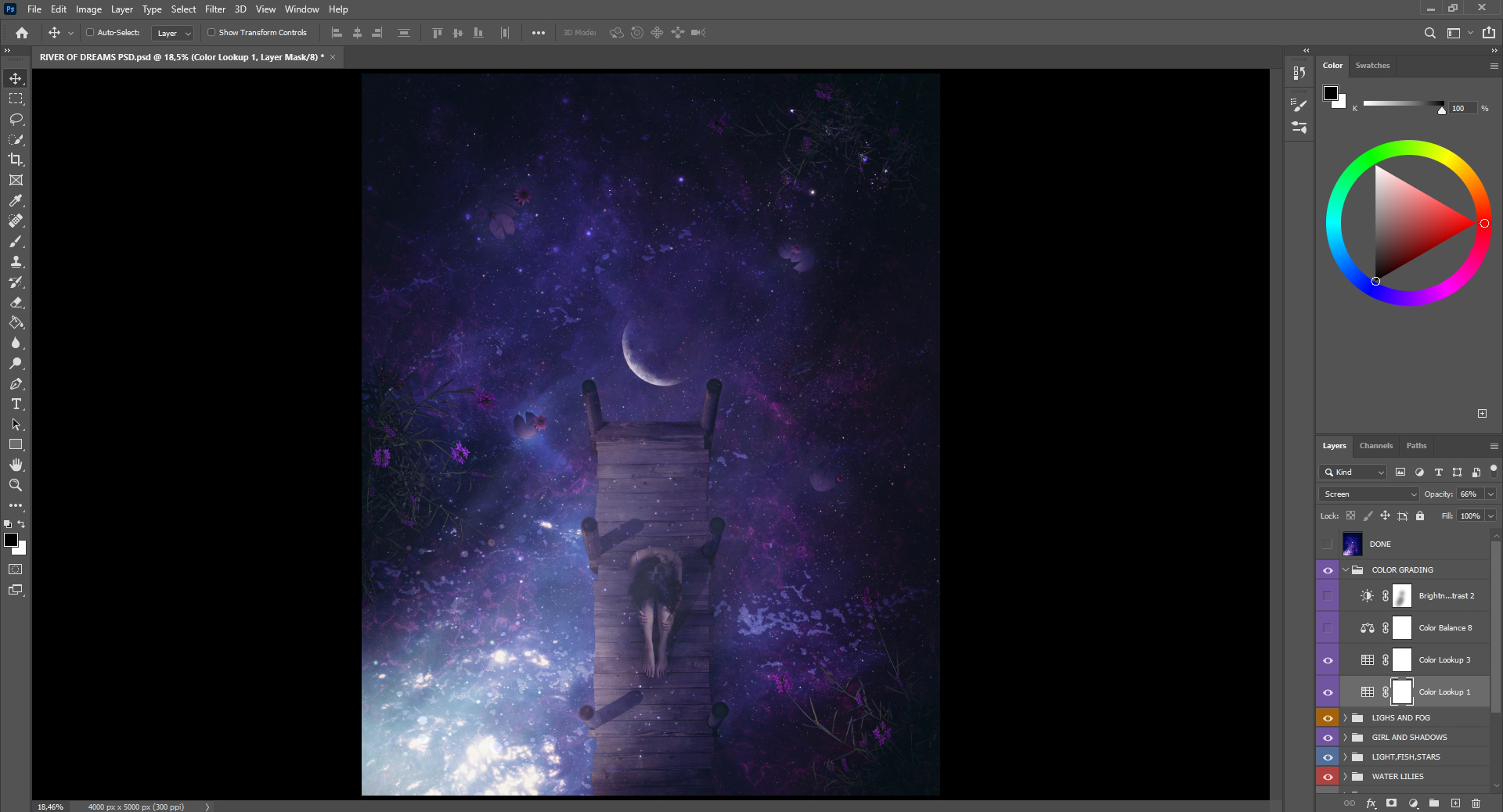
23. Then I add a final Color Lookup with purple/blue tones and Brightness/Contrast to darken everything a little bit more.
24. As a final step, I open the Camera Raw and adjust every slider till I achieve my signature style of coloring, from the lighter to the darker parts.
I set up the Radial Filter in the center and make it lighter in focus. I brought the shadows down a little bit, mostly by using everything in Camera Raw from Exposure, Contrast, and Highlights to Curves, Color Mixer and Split Toning.
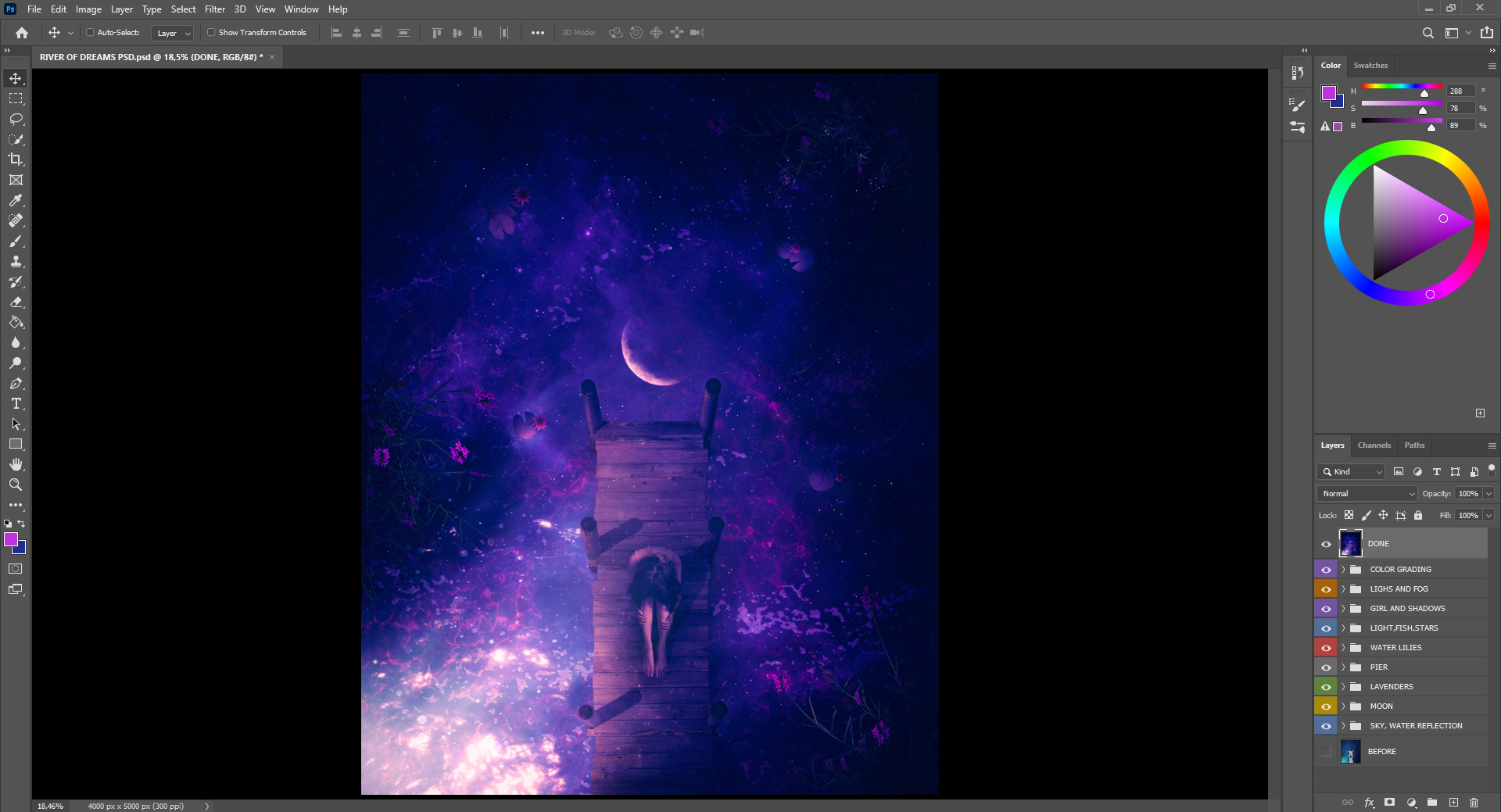
That’s it guys! I really hope you enjoyed this tutorial and that you have learned something new. You can see how playing with lights in my artwork relates to themes of lightness vs. darkness. Let your ideas go wild and don’t forget to follow your dreams! If you don’t already have a PixelSquid subscription, I really don’t know what you are waiting for! My work is on a whole new level thanks to their stock objects.

Aron is a Digital Artist from North Macedonia who specializes in surreal art. You can follow him on his Instagram, Twitter, or Behance.
If you’re interested in being featured in our artist tutorials and spotlights, you can email our content team at marketing@pixelsquid.com.